Future of the Past

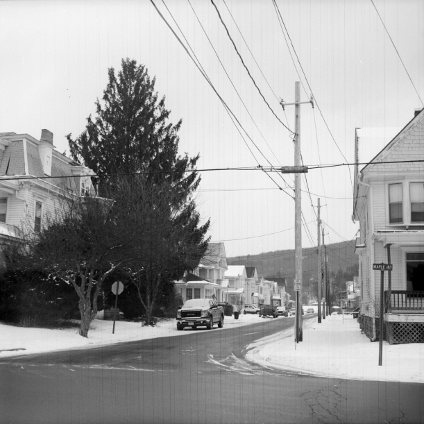
a backroad out of this traditionalist neighborhood


Leave a comment

Little Nuances

We have our midterm critiques this coming week and we are to have examples of each of the processes we have been studying and we need evidence of a coherent project going.  

We first started with toning black and white darkroom prints.  I needed to revisit this process because I did not have good prints or negatives with a solid idea for the project behind them.  

Then we did cyanotypes.  The biggest thing with the contact print processes is the negative.  The problem we were having came from the contrast that the computer hooked up to the Agfa printer was adding, so all of our negatives had much more contrast than we were expecting.  So I printed a bunch of recent photos at really awful contrasts, and they still came out great because of the computer’s alterations.  I also experimented with a variety of size, and I hope to continue doing more of this experimenting.  I want to find a negative worthy of printing 22×17, the largest negatives we can make.  I think I have found an image…

After cyanotypes we talked about toning the cyanotypes.  The ones I have ready for Monday are toned with Borax and tannic acid solutions.  The tannic acid is really lovely, making the highlights a rosy pink and the blue getting even darker with a light purple tint. 

Then we learned how to do the Vandyke process.  I personally love this process. The contrast is much lower and less of the image seems to wash off, which is comforting.  I love the tone of the brown and how it changes from an orangey to a bark brown in the fixer, then to a chocolate brown when dry. 

Finally we learned about putting vandyke over cyanotype.  The key to this is really making sure the vandyke is not exposed too much or it will not let the blue show through to create the lovely tone mixing.  

At this point I’ve got some good examples of each, but I will go back tonight and tomorrow to be certain, afterall, I’ve got the time and resources, why not. 


As far as my project/concept is concerned, I have done some thinking, re-evaluating, considering, deciding, editing, shooting, and I think I have figured out what is drawing me into the little town, why I enjoy photographing it.  What I got most excited about, I guess even from the beginning, was the weird oddities that presented themselves while I was walking around the place.  Sweeping part of the sidewalk, cutting most of a tree down but not all, 6 satellite cable dishes on a house thats falling down, a river contained entirely by concrete, just to name a few. I like these finds because thats what they are, little documents of an exploration, sharing the things I found that surprised me and did not seem quite right.  At the beginning of the semester I was a bit reluctant to wander very far, but as I got more comfortable with the process, I started wandering and the magic started happening.  Each of the images I am sharing in critique is not only printed in one of the methods we discovered this semester, but it tells a little story about the town and people of this town through the viewer’s discovery of that thing that seems not quite right. Overall I have enjoyed finding these little nuances, and I hope the viewer of the images will too.  


Leave a comment

The Land of the Blue

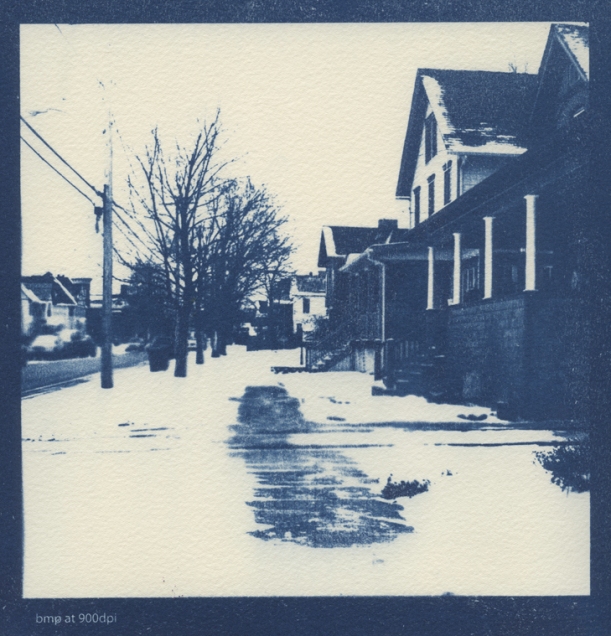
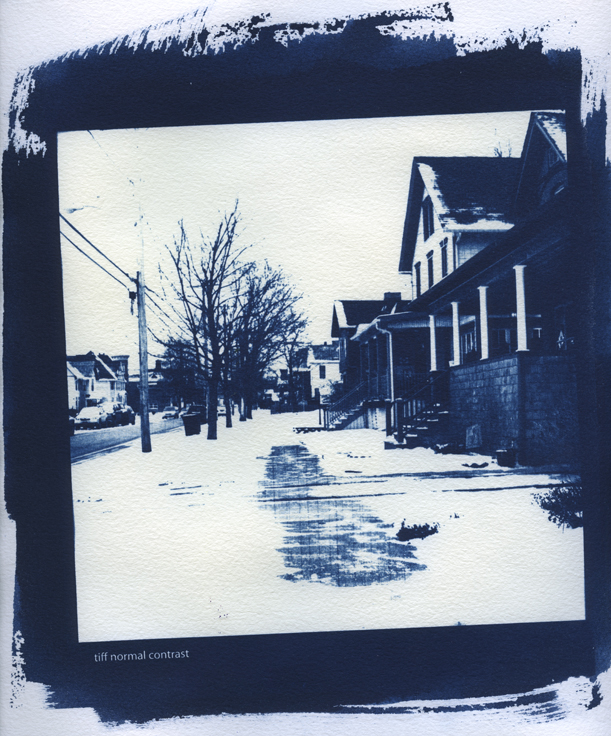
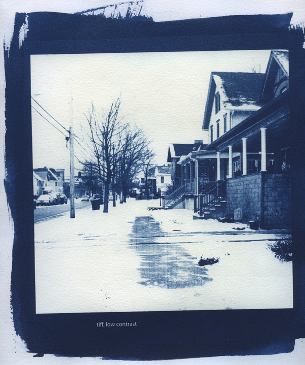
This weekend I spent some time in The Land of the Blue, aka in the studio printing Cyanotypes.  The negatives we were to print for class were enlarged negatives digitally printed on the Agfa printer.  I took one image from my roll of 120 and printed it out at about 6×6″- one at normal contrast, one at low, one at high, and one bitmap at 900 dpi.  I exposed them for about an hour and a half under the UV lights in our studio.  The first night I printed these on the Arches water colour paper, and the second night I printed on the Somerset satin paper, except I only printed low, regular and bitmap.  I also tried printing some of last semester’s 4×5 negs and some of the medium format ones from last week, but not enlarged.  I love the process so much.

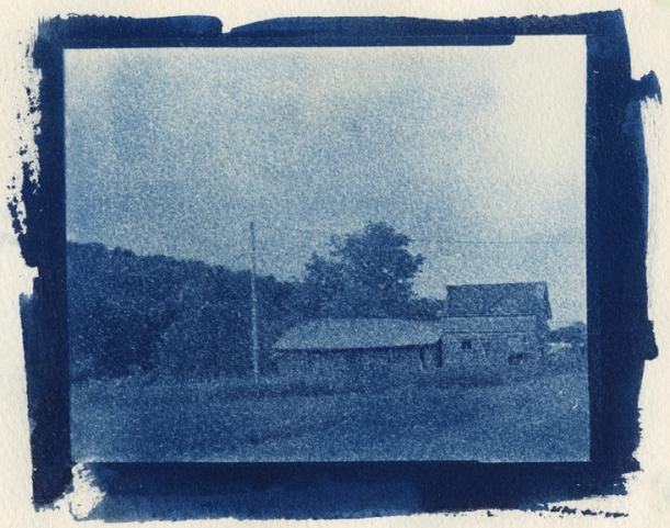
maslen_cyanotype_4x5

maslen_cyanotype_4x5_02

It is really great preparing the paper, putting on the cyanotype solution, adding the neg on top, and leaving the rest to time, UV light, and the paper and negative.  I love the elements of chance in the alternative processes, if it does not work out, just change something and do it again!

maslen_cyanotype_6x6

bitmap on Somerset Satin paper

maslen_cyanotype_6x6_02

normal contrast on Arches watercolour

maslen_cyanotype_6x6_03

low contrast on Arches watercolour


I prefer the Arches to the Somerset because it seems like a sharper image, more detail can be seen.  I also like the Arches because the Somerset was too fibrous, the  fibres in the Somerset showed more, leaving white dustings across the image whereas the Arches was tight and did not leave any white specs on my prints.   I love this process about contact printing, there seems to be something so very real and pure about the contact printing (more so from the real film than the digital of course).

Either you got it or you didn’t.


Leave a comment

Simultaneous Conversations

After our mini critique of the toning process, and my expression of how interesting it was that many different things could be going on at the same time, simultaneously, my professor suggested I watch “Slacker.”  I had watched it last year, but I was glad to watch it again.  Its a great film, the camera follows a menagerie of people around for the day, each doing different things, but somehow their stories all mesh together and make sense in the film.  The opening dialogue is brilliant.  The first character is talking to the taxi driver about alternative universes simultaneously existing at the same time.  The minute you make a decision, what you didn’t decide could have happened too, that whole story could have happened but it didn’t.  It sets up the scene for the whole movie.  A two hour string of different conversations, people existing, travelling through the day at their own pace, their own theme, not knowing about the other paths being travelled simultaneously.  Definitely worth a watch.

I’ve got a few other movies I need to watch, that might happen this week, it might not, hopefully it does.

I also watched a movie, earlier last week, called Bunny and the Bull.  Such a weird situation- the main character has been in his house since, as we find out later, his best friend died.  Its basically the story of how he builds up the courage to leave his house again, through the revisitation and telling of the trip he and his best friend took, at the end of which he died.  Strange, but really good as well.

So I went out to that little town again, similar weather conditions, a bit chillier, but that did not bother me.  I tried the second camera I was lent by my professor, a medium format double lens Yashica with the flip top for ground glass.  I liked this camera more than the one I tried last week.  Once we shot the negatives, we were to scan them in and make larger negatives (we have an Agfa Image Center) for contact printing Cyanotypes.

Still not sure what I was really looking for in the town, I set out again, determined to find something that excited me.

Luckily I did find something and my project theme is slowly getting whittled down to a more specific and manageable concept.

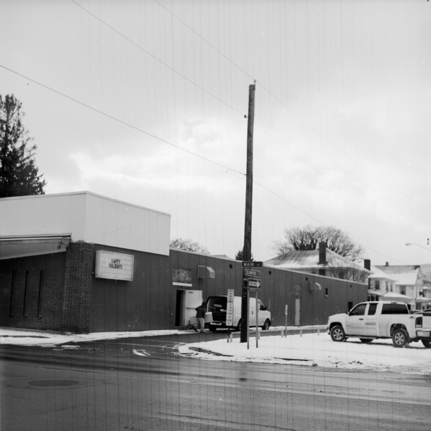
IMG_01

So this photograph was made February 6.  I found it so strange that the billboard still wishes “Happy Holidays.” I also loved the clearing out that seemed to be happening, loading quite a random bunch of things into this white van- creepy, interesting, weird, everyday, normal.

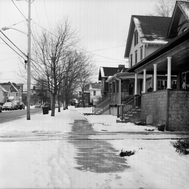
IMG_02

I walked down this mostly covered in snow sidewalk, except for this patch of about 30′ of cleared sidewalk.  It was not even cleared that well, one would think if you absolutely had to go through the trouble of clearing the walk just in front of your house, why wouldn’t you put some effort into it, and clear it properly.  It looked as though the walk was cleared better than their drive way.

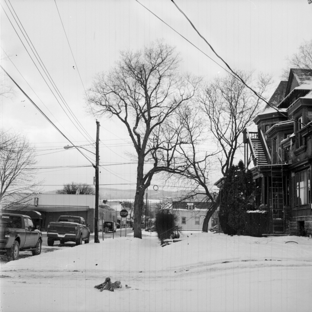
IMG_03

Walking down a street of choice, mostly random and possibly a bit of intuition, I heard a truck driving up the road, parking a little ways ahead of me, on the street.  The car lights turned off and the person hopped out, rather hurriedly. The man running from his truck was not what I had expected, he had on a business suit and a tan trench coat (open and flapping behind him).  His truck chirped as it locked and I kept walking on.

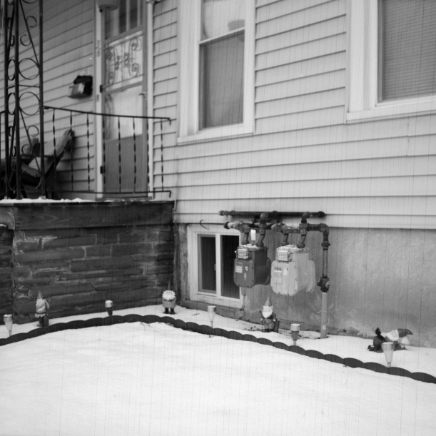
IMG_04

More than one gnome and garden lights, accentuating, rather than hiding, the meters.

IMG_05


Leave a comment

Focus

Our first “assignment” was to shoot new film that had something to do with the themes we are exploring in our project.  We then had to tone the prints using Copper, selenium, and tea.  I did not fix my film enough, hence the little spots at the bottom of these prints, but I have since solved that problem.

selenium

I liked the selenium toning best, the tones had a beautiful purple-ish shade to them, the blacks looked deeper, and the highlights seemed more illuminated.

tea

The tea dried darker than I thought it would, which is fine, I will stash that away for future reference.

tea copper

I did not like the copper toner on its own, maybe I did not have good photos to try it out on, but I thought it looked nice with the tea added to the copper toned print.  With this one, you can see the remnants of something on the drying screens.  Not something one would necessarily want, but I like it in the sky.

The camera I was using is a medium format 6×9 camera.  At the time of printing, I did not have the film carrier for the enlarger, so I just used the 6×6 one, but again, I have the correct carrier now, for future use.

I started out that morning not sure of what I would find, it was snowing a bit, so the lighting was not great, but I did in fact find some pretty beautiful things.

IMG_01

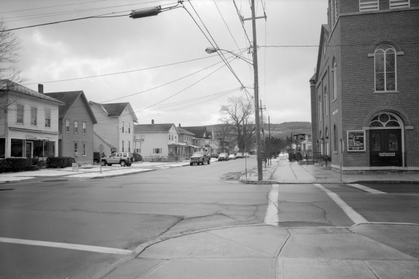
This is the negative scan of the complete image.  I really liked this view because in the foreground is the town; houses, cars, wires and poles, and in the background is the large hills this town is surrounded by.  Its not completely obvious, but once you find it, I think its a unique quality to this town.

IMG_02

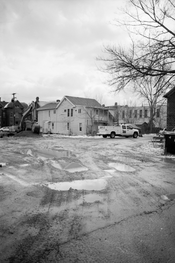
I first happened upon this scene from a different road, from the front of the house.  I was initially drawn by the presence of the bulldozer and how it was just working, quietly moving around dirt, no one seemed to take any notice of it.  Several people on that street were on their porch, smoking or whatever.  So I went around the block and found this odd parking lot/alley.  Originally I wanted the bulldozer to be the subject of this photo, but now I think it is really the parking lot, the reflections in the potholes juxtaposed against the stoney surface.

IMG_03

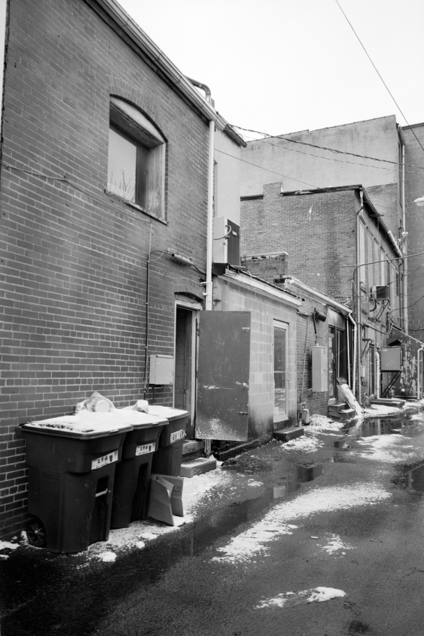
I was walking back towards my car and I came across this open door.  I was reminded of old cartoon movies where the big bad chefs hang out outside the back door.  I wanted to see what was inside the doorway, but I decided I would rather be left imagining and supposing, making up my own reality, than finding something anticlimactic.

IMG_04

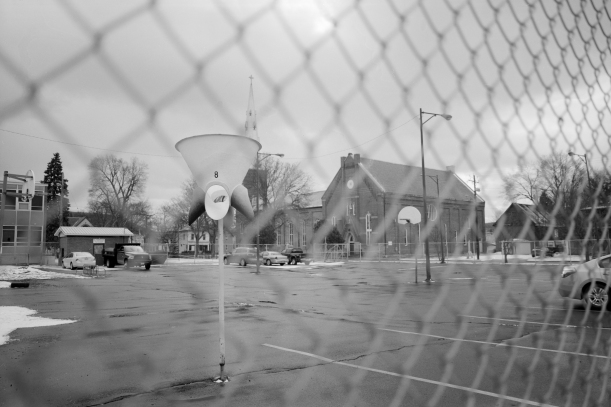
It is hard to understand this space.  It was quite odd, there was a fenced in, asphalt, playground-which is fine, my elementary school had an asphalt playground, but it was not fenced in, and there were no parking spaces and cars in it.  I could have gone inside, but the most interesting thing about the space was the fence that kept it all inside, and everyone else outside.


These are the first photos I have taken since my class with the 4×5 view camera.  I really like the view camera and all it can offer, but I definitely noticed myself paying more attention to composition, lighting, subject; I am more conscious, but I am not convinced I like this camera.  I also have not really taken many photos in a town, and much to my own surprise, walked around a town or city at any length.  People surprised me, streets surprised me, buildings surprised me.

“People do strange things and sometimes we’ve got to put some focus on them to realise what we’re doing.” Maroesjka Lavigne